A few weeks ago, the Scottish government announced the scrapping of Stamp Duty and the introduction of the "Land and Buildings Transaction Tax" and there were several graphs showing the old and new schemes.
After the Autumn statement announcement last week, which introduced a new stamp duty, I had wondered how the different tax systems compared. I had then found that there were several graphs comparing the old stamp duty with the new stamp duty. What I could not find were any graphs comparing all three schemes.
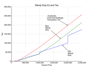
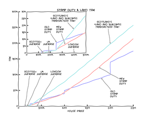
So I decided to make one myself:
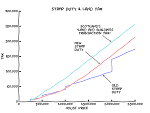
I made it using python with the library matplotlib. The default settings give a very clean and clinical graph. The purpose of the graph is not to read off the exact prices- if you want to do that, do the calculations directly to get accurate numbers. Instead, the graph is meant to just provide a rough visual comparison. One of the features that matplotlib can provide is a function to change the defaults to make the graph style like XKCD. I prefer the look of the XKCD graphs, so I started using that from the very start.
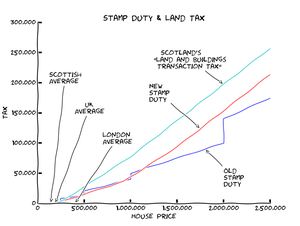
I then added the average house prices for various locations in the UK. I used figures from the Nationwide Regional Quarterly Indices Post '73
Giving me:
- Scotland - £142,288
- UK - £188,810
- London - £401,072
I then annotated the graph with these points:
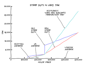
After these were shown, it became obvious that, while the graph was good at showing the difference for the multi-millionaires, it didn't show the average price range very well.
I re-made the graph, only showing the values up to £500,000- an arbitrarily-decided "sensible" figure (it make the graph look nice):
This was the point at which I posted the last two images to twitter.
After thinking about it further, it would be nice to include both versions on the same graph. With a bit more fiddling, I came up with:
Go Top« Yes Because
Cutting it Fine »







Comments
I would love to know what you think. To comment on this article, send me an email
No comments yet.