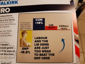
And this elections prize for most deceptive graph that I have seen goes to the conservatives.
To be fair, I have mostly been ignoring this election as far as possible, but the flyer put through our door managed to surprise me at its creativity.
It is completely true, but just because the conservatives managed to increase their share of the vote the most last time, they still came third. Labour and the Lib Dems may well be too weak to win, but by that logic, so are the conservatives considering they were beaten by Labour.
But the chat looks impressive all the same.
Go Top« Believing Signs


Comments
I would love to know what you think. To comment on this article, send me an email
No comments yet.